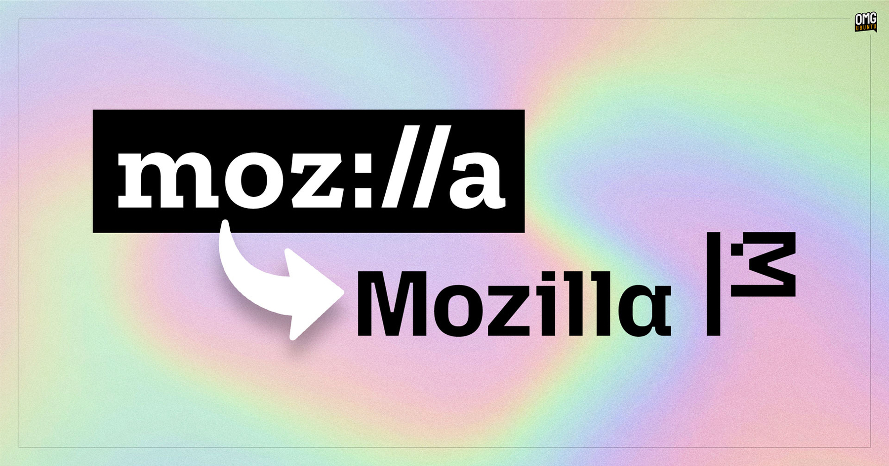
Mozilla’s New Logo Brings Back the Dinosaur Mascot (Kinda)
It could be viewed as a flag on a pole. Sort of like Mozilla planting its values in the ground to say “we’re here, come join”.
But it’s more likely a nod to the original Mozilla mascot (inherited from its Netscape beginnings), which was a red dinosaur (an interesting logo of itself as it was designed by Shepard Fairey who created other seminal design works, and the skate brand OBEY).
I’m a sucker for throwback design language and ASCII doodles. Wonder if this will stick?
